Monday, October 17, 2011

"The Last Horizon"


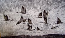
Here's another piece in my recent series, where I'm exploring thinner layers of color over an underpainting of sepia tones. It's giving my work a looser, more gestural look as well as building up layers of light.

As with "Odyssey", I began this piece with burnt sienna mixed with a glaze, then wiped out the highlights to begin feeling the composition. Subsequent layers deepen the dark tones and add highlights to the light areas.

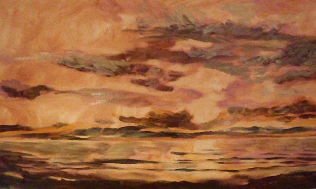
This is from a trip to the Oregon coast earlier this month. It was one of those amazingly beautiful days, and a rare one in the Pacific Northwest where the beach was warm, sunny, and there was no wind.

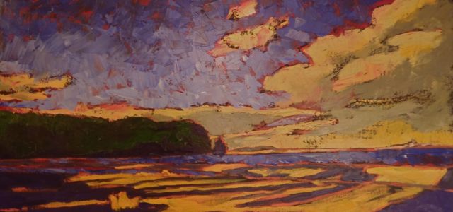
The title comes from our constant push to the west as North Americans; we were always looking to the west and striving for the hope that it represented. The horizon is a place of desire and hope; no matter what is going on in our lives, there's something different right over that horizon, if we can only get there. We long for it, we strive for it, but can never achieve it. The horizon remains a distant wish. It's the joy and myth of travel, the idea of adventure and, most of all, arcadia.

Wishing you beautiful autumn days filled with light.

Dawn

Sunday, September 18, 2011

Odyssey


This piece marks a solid change for me, in the fact that is is made up of many transparent layers and gestural brushstrokes instead of the thicker, more solid layers I generally use. It brings the excitement of my experimental drawings into my oil paintings, something I've been working towards for years.

"Odyssey" used techniques from my watercolor and drawing background, resulting in a fresh approach. I usually begin my oils on black gesso and draw the light out of this surface. This piece started on a white canvas, followed by a glazed out transparent Italian Burnt Sienna, into which I wiped out lighter sections with a paper towel. Next I added highlights, still with glazed out layers, then followed by pushing the darker tones, also with the glazing.

I'm very pleased with the liveliness and freshness of this piece overall, and the joy of working in a style I have not used in years.

"The Odyssey is a 90’ yawl designed by Olin Stephens for Mrs. Barklie Henry, a Vanderbilt granddaughter. Built in New York in 1938, the Odyssey quickly proved herself as a winning member of the racing community of Long Island Sound. The family enjoyed cruises to Cuba to visit Ernest Hemingway, and also to the Galapagos Islands. The US Navy commandeered the boat for the duration of World War II, where she served our country in radar, sonar testing, and echo sounding studies. After the war, she continued to serve the Navy as a research vessel out of Woods Hole, later in San Diego, and finally in the recreation program. The Odyssey found a new home with the Pacific Harbors Council of the Boy Scouts of America in 1978, and now serves as a sail training vessel with the Sea Scouts of Tacoma." Sea Scout Odyssey

Monday, September 5, 2011

Yakima River, completed


So here's the finished piece. I'm pleased with the overall emotion and composition. Even though there was a lot of back and forth in my mind on this piece, the overall resolution works for me. It reflects the spirit and emotion I felt when I stood on that bridge over the river at a point in time last July, with a storm moving in from the west. A sense of still energy; moments of quiet heaviness before the rain began to fall.

Friday, September 2, 2011

Yakima River


Here are a few images documenting the progress of this painting. It's still a work in progress, but I'm pretty close to resolution I think. The mood is almost there: a storm moving in over this mighty river, an image from last July.

It could be the Colorado, or the Snake, or the Green River. There's just something about a river, particularly when you live in the West. It's a blood vein, a refuge, a lifeline.

I'll post the final outcome on this sucker. It's 36"x60", oil on canvas.

Dawn

Friday, June 24, 2011

Painting is a Lot Like Training a Dog...


So when you train dogs for basic obedience or agility, it's important to focus on your intent. You want to have a clear vision of what it is you want the dog to do, then use your body language as well as the command to communicate that to the dog. This clarity is also important reinforcement of alpha-dom; anytime the dog thinks it might be the one driving the bus, so to speak, your ability to keep the message clear and simple makes a world of difference.

Before I begin a painting I always have a focus; a mood, an atmosphere, a focal point, whatever it is I want to achieve with that piece is at the top of my mind. Occasionally it's so clear from the beginning, like with this piece, that it is difficult to figure out what the next step might be. The under-painting had such dynamic marks and mood to it, but it was not finished. Taking it to the next step was really tricky because I didn't want to lose that freshness. Somewhere along the way I lost the focus and that dog ran away from me. After repeated calling and a lot of treats (for the artist in this case...) I got it back. I had to spend about a week without painting, re-focusing, thinking about what the core of this piece was about.

In the end the painting is somewhere in-between: it isn't as fresh and as raw as it was initially, but it is defined enough to feel finished.

I will never be the kind of dog person whose dog is always well-behaved and orderly. I think that obedience is necessary for good dog citizens and for their own safety and well-being; but I also like them to be dogs and have fun. This is so true of my art as well. There are some 'rules' that help make a painting successful, but you have to understand that at some point that sucker will run away from you, chase a seagull down the beach, and find something stinky to roll in before coming back to you.

Title of this piece is "Elwha Maples." Oil on canvas, 36x48". The top image is the under-painting, the bottom is the finished piece.

Friday, June 3, 2011

Storm King


New painting! 36"x60", oil on canvas.

This is from a hike I took a couple of weeks ago at Lake Crescent, one of the most amazing places I have ever been. It's the Washington State version of a fjord. The water is this weird blue; it has a lot of nitrogen which inhibits algae. The true depth of Lake Crescent has never been established; a glacial lake created by an ancient landslide/ dam. And truly magical.

This is Storm King Mountain (does every mountainous state have a peak named Storm King?) reflected on the water.

My biggest challenges in this piece had to do with the reflections on the water. There is a drama and still a subtlety to them that kept me on my toes.

Hope you have some great hikes and paintings going for you as we slowly roll towards summer!
Dawn

Thursday, January 27, 2011

Whale Bone Drawing Session


The Marine Science Center in Port Townsend has one of the very few intact orca skeletons in North America, owing to the fact that orca bones sink. This adult female had many health issues, and died on the Dungeness Spit 7 years ago. The remains have been in the process of cleaning since then.

Scientists and volunteers are about to articulate the skeleton. They invited a few artists in to draw individual bones before they are put back into a whole.

As a person who has drawn many bones in her life, I was truly amazed by the beauty in the form of these. What an amazing animal.

Dawn

Saturday, January 1, 2011

Irondale Beach


Irondale Beach is a beautiful little spot where Chimacum Creek runs into the bay. It is being remediated by various groups owing to contamination from a very old steel plant that was on the site. Friend Deanna, who is involved with the remediation, gave me a great tour of this unique place on a beautiful day in winter. I caught this magical light just before it disappeared over the hill for the day.

The painting is 18x36 on stretched canvas. The first step is my initial outline with oil paint, basically a drawing with a brush. I gridded this initially to make sure I had the proportion correct; I really wanted this piece to recede to the horizon in a convincing way. The second step is the underpainting, looking at value and composition. The third step shows some local color being introduced, and by the time this is done I see a composition flaw. Towards the right hand side of the canvas here you can see a structure on the horizon; this is the military base Indian Island. Unfortunately this is too far to the edge of the canvas. As the shadows all point this direction it has the effect of taking your eye off the edge of the canvas instead of having a contained motion within the picture plane. So I moved it. You can't see it well in this photo, but there is still a faint structure on the horizon, moved in about 6 inches to the left. This keeps the motion more circular.

One of the many reasons to be a painter: you can move whatever you need to, including military bases, in the quest for good composition! Ah, power....

Happy New Year, and happy painting!
Dawn